By: Michael Diedrick on Sep 2, 2019
Website Navigation and Sitemap Strategies for Libraries
Why Navigations and Sitemaps Matter
Libraries are vital institutions to any municipality as places of learning, meeting, researching, job hunting and finding a starting place for a myriad of subjects and citizen needs. From what I’ve seen, libraries are so busy with the practice of librarianship that they haven’t been all that successful at showing their offerings and the value of libraries in general.
The modern website affords us a singular place to connect citizens to the value and offerings of their libraries, but that’s a bit of work to get right and an art that’s rapidly evolving. There isn’t a library or cultural institution website we build that doesn’t teach us new ideas and concepts, and looking back on statistics and talking to a site’s users is helping us develop and evolve the practice of building effective library websites.
Library navigations are important to get right because of the wide range of people visiting a site, and the range of needs those people have. Unlike most websites, libraries have a lot of extra work to do because of the amount of content needed and the range of users and user abilities. We often hear librarians consider their website an online branch, which requires the care and thought an offline branch would take.
Notes on terminology:
We consider people to visit and use a website as a user, as much as that term sounds demeaning. Users are not just people, they’re people in action: browsing, searching, researching, looking for events, etc.
The depth of pages on a site as follows: home page, primary pages, secondary pages, tertiary, quaternary, etc.
A sitemap is a complete visual representation of the all the navigations to their complete depth. This includes all pages on the website.
The Big Picture on Navigations
A navigation system is the working part of a site’s content. It’s the site’s interface that matters the most as it gives access and clues to the entire website. A navigation system needs to show the width and depth of the content on the entire site, and lead people to explore that content.
The main navigation is only one navigation on any given site, and the placement of the navigation itself gives contextual clues as to its relevance. As there are different types of navigations on a website, like a main navigation, utility, footer and other specialized inline navigations, people tend to get the context and start hunting in the right place for the content they want.
Sitemaps are for all proposed content, not all current content. We map out all the pages that should exist, and over a year’s time the missing pages will be written and edited by staff. 100% of websites we create have missing content when the site goes live, and that content comes online whenever it’s ready.
Each navigation on the a website is a mini-narrative: the navigation has to tell a story that usually covers that width and depth. Often times the story ends with what you’d like them to do, get involved, donate, etc.
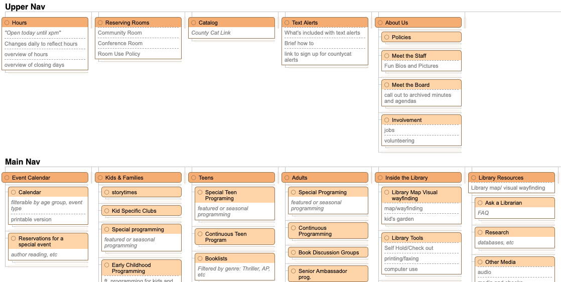
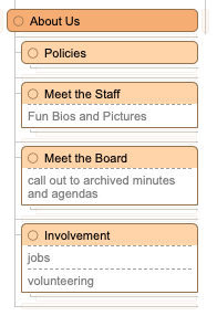
Content and Navigation Hierarchies: 1. Parent / Child Groupings
Being public institutions with a plethora of content, library sites also need to have strong content hierarchy that groups types of content together, the primary groups of content are the primary navigation items. Then the secondary items that fit within the primaries are known as related to both people and search engines.
We use folders to group and describe the content beneath them, like
/about/
has all the about content and
/about/policies/
is the policies related to the about section, i.e. the library’s policies. Without the grouping, the context of policies is lost, and could be about policy in general.
Content and Navigation Hierarchies: 2. Header Groupings
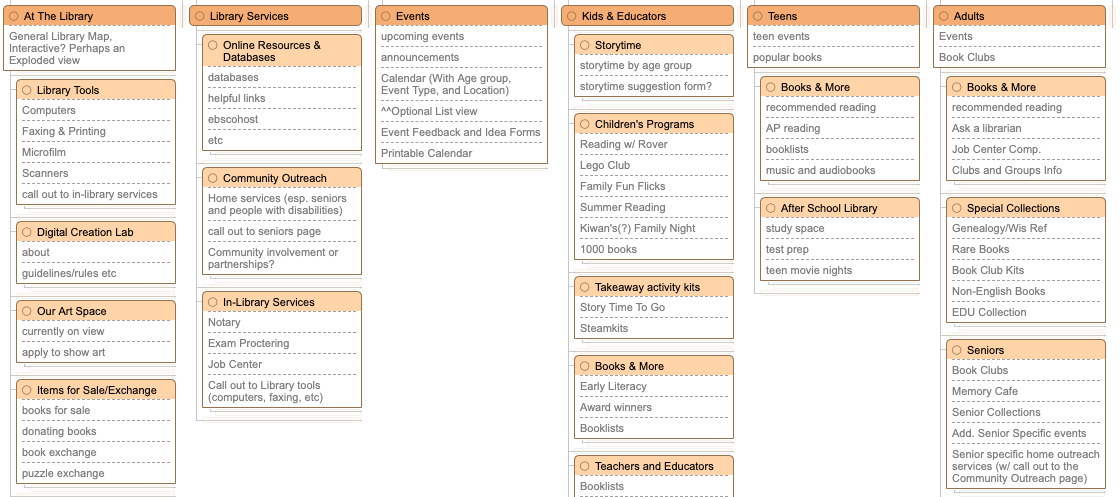
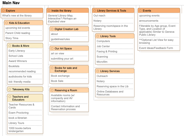
Sometimes the amount and types of content dictates how you organize it, like if there’s so much content that the groupings of content in directories would cause a four-level deep website that doesn’t have four actual levels of content. As such, simply grouping the content under headers can suffice, like this example from Milwaukee Public Library.
Content and Navigation Hierarchies: 3. Space or Layout Groupings
From time to time we use space or navigation location to break up the navigation to be parsable. Sometimes it’s just a little space or alignment that makes it work, or a layout or typographic change that makes it stand out.
Not our work, and later we’ll see the rest of this menu
Iteration and Wrapping Into User Experience
We never create just one site map, and we don’t just create a site map and chisel at it until it’s complete. There are multiple competing ways to think about the content on a library website as a whole, and so multiple navigation explorations are required. Think of them as themes: collections focused, services focused, people focused, user-need focused, etc. Chisel any worthwhile ones down until there’s a few favorites.
The navigation needs to solve every use cases that’s defined for every audience segment. We have a process of defining the needs and learning about the most common and important ones, and based on that, we want to keep all important content within two clicks of landing on the site.
Different librarians have competing visions about what needs to go on the website, of course, and sometimes those visions will be in opposition to other visions. While each librarian will want to promote their events and content, the sitemap should fit all of the content and not promote content based on internal needs. Websites use other vehicles for promotions including the home page campaign system, mini-introductions to departments or events on the home, campaigns throughout the site, on-kiosk promotions, on-digital signage promotions, etc.
User Testing
If you don’t know how users will react to a site map, or even if you do, user testing can be a great way to test your competing site maps with real people. That can mean standing at a checkout desk with $10 gift certificates for a few minutes of their time and handing them a clipboard with the site map on it and asking them a series of questions like “if you were looking to find open hours, where would you go?” and “you need help finding a job, where would you go?”
Or, my personal favorite, put them in front of a prototype of the menu or website and ask them to actually find the content. Simply watching users on websites sounds boring or invasive, but it will assuredly teach you how people think online.
There are also services that offer deeper testing. There’s a lot more for another day on user testing, but the primary idea is that if you actually ask patrons to work on tasks you've created and see how they achieve them.
A simple user test can be done via sitemap alone, done in this case by Digital Ocean
Common Navigation Types
We mentioned above that exploring competing themes helps find the best sitemap and navigations. Here’s a few ways to theme a sitemap:
Collections and resources (Locations, Hours, Books, Media, Databases, Meeting Rooms)
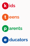
User navigation (Kids, Teens, Parents with Small Children; or Faculty, Students, PhD Students, Social Science students, etc., as an example from Whitefish Bay Public Library)
Human-centered navigations (Discover, Explore, Grow, Connect), which usually have slightly better descriptors below them, like Discover: Online or In Person, Explore: Our Collections (an example from Shorewood Public Library)

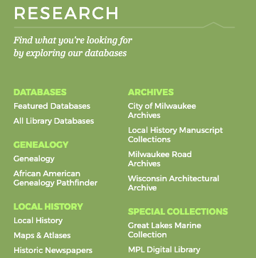
Wider navigations that explore a wider view of what the library is, like Resources, Recommendations, and Research from Milwaukee Public Library,

Specialized Navigations
Context navigations are vital to exploring child- and nearest-neighbor content, and to help the user understand where they are in the content, and should be used on all secondary and tertiary pages.
What’s Inside navigations can help people discover content that’s child to their current location, often times showing secondary level content on primary landing pages. Those can be automatic and pull the page image and the page description to fill them out.
Quicklinks are good for the following, less common conditions:
On-telephone explanations for FAQ
Via podcast/radio/tv/presentations to communicate relevant but deeper content, like “go to our website’s Quicklinks and click on Today in the Library.”
Time-based content, like Holiday Hours.
Campaign-based content like Summer Reading

Example Quicklinks from https://westbendlibrary.org
Orphan navigations exist when there needs to be a grouping of pages without natural locations. It’s common to do this in the footer.
An orphan page is a page that doesn’t really have a place in the navigation, perhaps related to a temporary campaign or just deep content that users don’t need to see like an intranet or staff email portal. Because every page on a site we build needs to live somewhere in the hierarchy, we don’t have real orphan pages very often.
It’s possible to include actual orphan navigations, like for staff, at the bottom of the homepage and potentially have it related to IP or other credentialing systems, or just have it available to the public and have it designed in a way that makes it clear those pages aren’t for regular people.
Signs of a Good Sitemap
Sitemaps that have three to four individual navigations, and usually a maximum of three levels deep.
Sitemaps that have a good distribution of content throughout a site, note that most primaries have secondaries and most secondaries have about the same amount of content
Sitemaps that have pages that aren’t written yet — the content will be built over time.
Duplications of content are fine. Usually the content lives in one place, like a Contact page might be /contact/, but other places in the site map have links that point to the Contact page.
A system on the sitemap to describe the type of content, or when there are multiple elements for content, like blog posts. (We call them “stacks.”)

Things to Avoid
Navigations that have more than 7 elements per level. People can’t parse more than that without losing or just skipping something inside that level. There are exceptions, notably the use of headers groupings (above), and other design-based solutions.
Not our work, because 18 equal items are unparsable by humans
Any level that has one child. Push that content up one level, or wrap the content into its parent page.
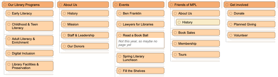
Note the History page under Friends > About Us — it’s has only one child, and it’s the only one of its depth
Any one section on a website that’s the only of its depth. If there are only secondaries and you have one tertiary section, find a way to promote it to the secondary level, or find other content that fits well in a tertiary level.
Avoid unique tertiary levels (Books & More, Takeaway Kits, etc.)
Takeaways
Navigations are the most important interactive element on a website, and successful library website needs good discovery and planning to find the right navigation systems, and a good portion of that planning happens in a site map. While there are multiple navigations on a website, people can figure out the meaning contextually, and as such navigations get a bit easier simply by grouping content per navigation, like the utility navigation having utility and tool content. Navigation themes should be explored, and navigations can be specialized in a variety of ways. Navigations and sitemaps become much more useful through doing iteration and experimentation, and keeping within the rules of hierarchy.
What is your experience with library sitemaps and navigations? What am I missing in this writeup? Got any good examples of other navigation types? I’d love to hear it.