By: Joy O'Brien on Oct 22, 2014
“I want you to have business cards,” Michael announced to me one morning, coffee in one hand and his own card in another. He handed it to me and continued, “but this design is old, and it’s not working anymore. How would you like to redesign it?”
I looked at the card. It wasn’t bad, but he was right— it needed a facelift. But it wasn’t just the card, it was the wordmark as well. It was plain. It needed some character.
I took a moment to think about what I was about to ask Michael. “Can we redesign our company’s brand?” seems like an innocent enough question. We design and distill other companies’ brands all the time, and with great success. And who better to design our logo than ourselves, right?
You would think so, but that assumption is usually wrong. It’s why big companies like Starbucks or events like The Olympics pay millions of dollars to branding agencies to do it— a brand can make or break a company. It can cause huge controversy, too. We all remember that Olympics 2012 logo, and the most recent iteration of the Starbucks logo warranted over 500 complaints on their company blog. And they aren't the only ones who got backlash for a brand refresh.
So it’s risky, redesigning a company, and doing it for yourself is even more challenging. That’s because we’re so deeply entrenched in our own culture that it can be difficult, even impossible, to distill it all. If I asked Michael for the opportunity to redesign our wordmark, there was a good chance the project would never get off the ground because we’d struggle to come to a consensus on what the brand should say, ultimately.
But then here the new wordmark is, against all odds, soon to be sitting in the navigation bar at the top of this page. There are a handful of reasons for why this rebrand effort succeeded:
1. I’m quite new to Byte, almost like an outside consultant. I’ve been at Byte just long enough to understand the company, but not so long that I’ve lost sight of what makes it unique.
2. My client, Michael (Byte founder, my boss & proud owner of too many opinions) was a good communicator. Once I felt I was onto a design that would work, he helped me push it to its best form, which is what you see today. Then, instead of waffling, he tested it.
3. We tested it by sending the logo out to a number of our most talented and honest friends and coworkers. We gave them a couple different versions of the logo to look over, and we got some great feedback. All in all, though, the new wordmark was a hit.
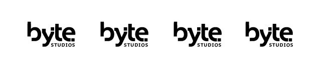
Oh, and we also dropped the “studios” from our brand. Just call us Byte now. What’s that you say? You already did? Right. Exactly.
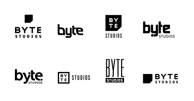
Below is the progression I worked through as I designed the new wordmark. The first grouping are the marks that made past sketching phase an onto the computer. The “this is a good logo, but it makes us look like we’re a clothing retailer” ones.
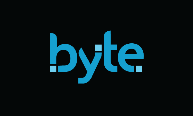
The logo on the bottom left of the group was chosen to keep refining, and it’s what brought us to our final logo, in all its glory!
Cheers!
![]()