Work
filter your experience
History Comes Alive!
Transporting the visitor into a movie set, or how a little house museum makes a bigger impact online.
Background
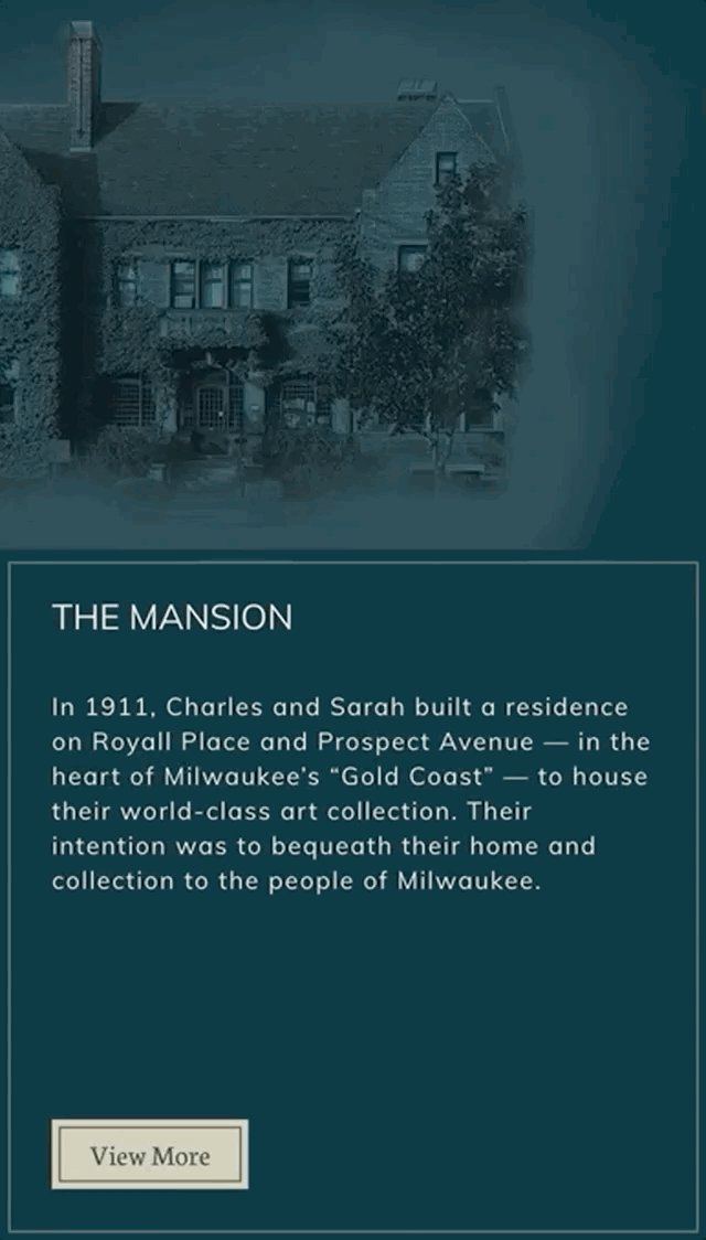
Charles Allis Art Museum is an east side Milwaukee house museum that lets you walk back into time and into the lives of Charles and Sarah Allis. Charles is a magnate of industry and art and antiquities collector who died in 1918, and his wife lived in the house until 1945. The Allis transports visitors back to the time of his death in their house chock full of paintings, sculptures and furniture that the Allis family bought in their travels.
The property is part of the Milwaukee County Park System, and like many house museums a good amount of revenue is derived from events and weddings. And it's a loved, unique Milwaukee experience.
We built this site in concurrence with a sister museum website, Villa Terrace Art Museum. Charles Allis and Villa Terrace are very different experiences, so we needed to connect the two sites together while at the same time making them distinct and experiential.
The difficult part is that both museums are hidden gems. We were asked to help change that.
User Exploration
Like any museum, there's a seemingly endless amount of stories to tell. A place rich with history can follow the story of the original owners, the building's architects, the exhibitions, the exhibition artists or the history itself of the process and journey of being a museum. We started by asking questions about visitors.
When the museum board started their search, they were ahead of the game and created a list of the types of users they'd like to attract to be more involved with the museum. That gave us a head start with identifying and asking questions to a variety of people that were described by the initial list. We also created our own list things people would like to achieve on the site (use cases) and the general process people become more involved (user journeys).
Content Strategy Exploration
These explorations lead us to a few different directions the content strategy might take. We used our inhouse site mapping tool that helps us explore different competing content strategies easily and makes presenting site map and content ideas easy and comparable. This process helped us realize how different The Allis was from Villa Terrace. Charles Allis was a traditional house museum with the owner/art collector's objects and art preserved from the time they died, and walking in was walking into a time machine. (Villa Terrace has very little family artifacts and art from the Smith family who built it, and this museum's visitor experiences were completely different.)
In the end, we all decided that The Allis exploration was about the mix of people, events and the space, so our tools were about who Charles and Sarah were, integrating events into content areas, and showing the space where the items are, with the hopes to build more data points over time about the items and their acquisitions.
Collections
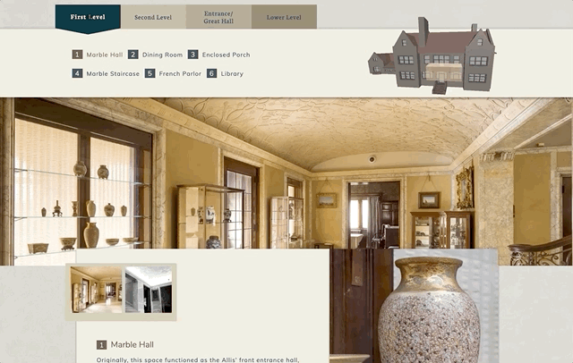
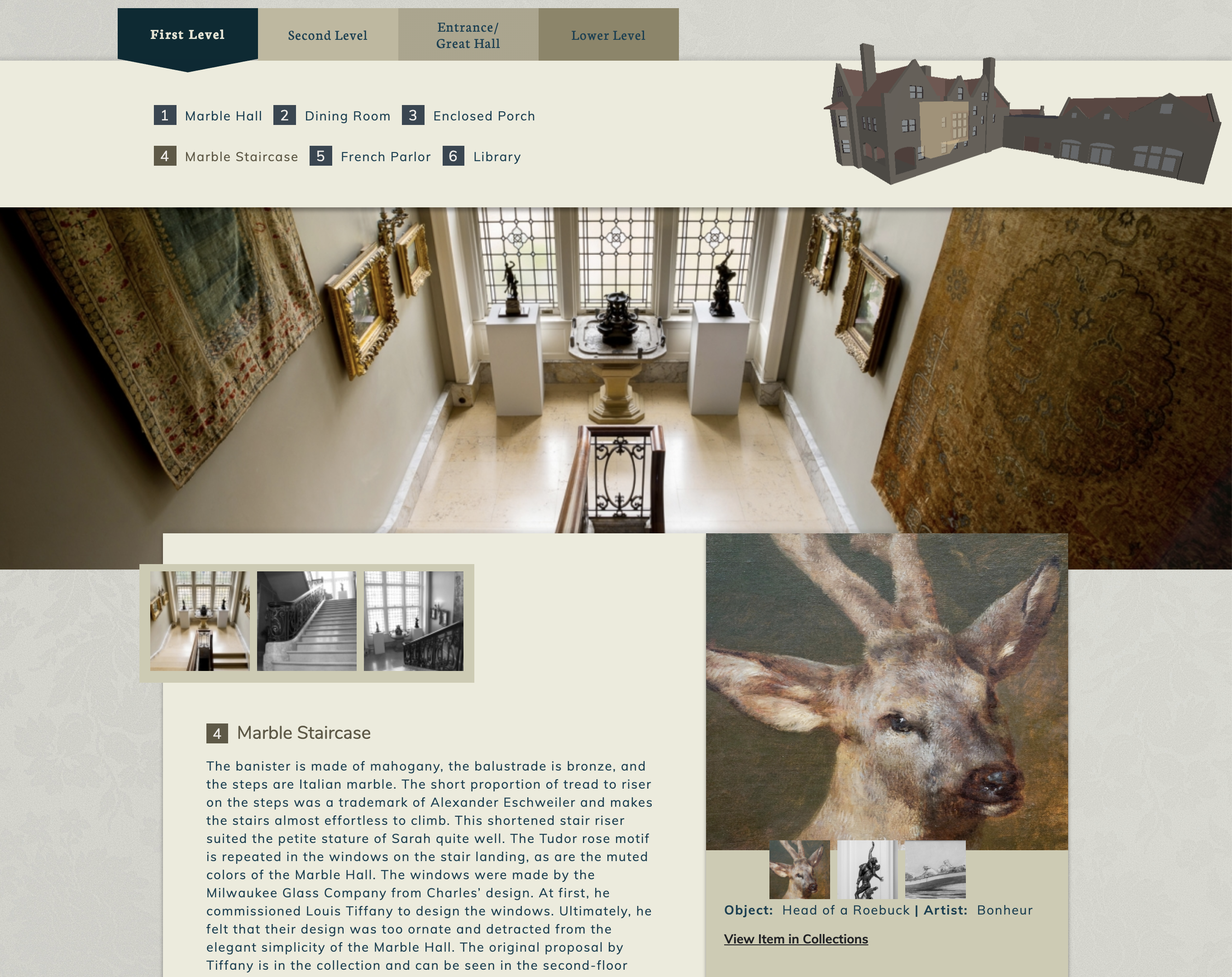
As this site was done in concurrence with Villa Terrace, it was interesting again to see how much the museums diverged in terms of experiences. The collections are very different. We divided the interface for Charles Allis' collection by floors, rooms and then objects. Villa Terrace has the Smith rooms and the Colnik Collection, but most of that space is devoted to changing exhibitions and general space.
The floors/rooms/collections hierarchy is easy to switch in other settings, but for a house museum it works for the visitors' use cases. People remember items and want to share those items with friends, or people want to learn more about one of the vases or paintings, and the way they remember is by location. We created a visual cue as well, as we talk about in the lagniappe section below.
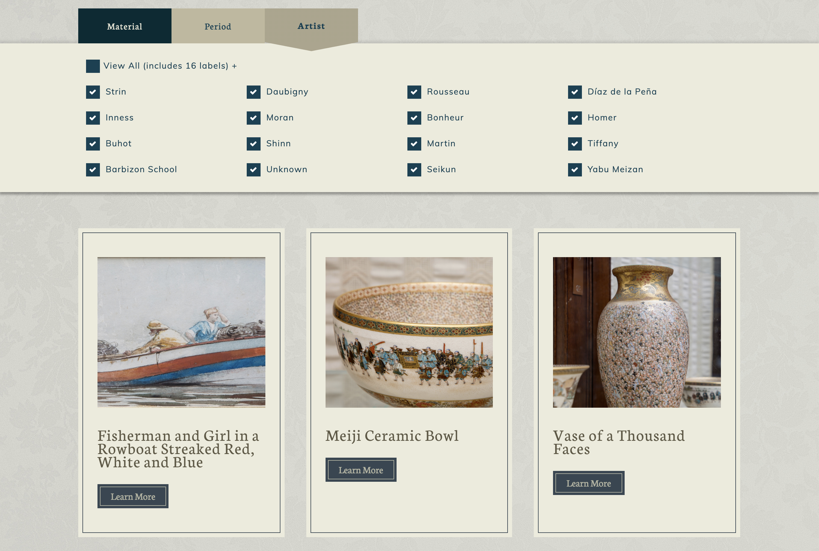
There's also a collections tab if a visitor didn't know where the item was, or a visitor was trying to learn more before visiting. Filtering here is done in three types for The Allis, material, period and artist.
Visual Exploration
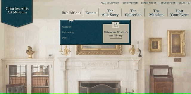
The experience of The Allis is temporal. The house has a lot of artwork and is clearly dated to early 20th century. A visitor can imagine a movie set, a mystery taking place around every turn. We went headlong in these themes and found a visual system that connects to the house and the experience. We wanted the site to be as explorable as the museum, but we didn't want to discard the mystery.
We use content timing to its fullest extent on the site. The Allis is deceiving, there is a lot more events and possibilities than meets the eye. It's vital to show people right away the depth of the content on the site, and hint at the depth of possibilities at the museum. We use dynamic content early and often, in site navigation, on the home page "above the fold" and in buckets throughout the site.
To show the content depth, we filled in content and details with "micro interactives" on the home page, always being able to scroll between a few elements of Allis story renting the space for a wedding or event. On-page explorations cover much more ground than page clicks -- nobody wants to wait for another page to load if there's something on-page that can do the same thing. Much like the rest of the design, we created a simple visual language with the arrows to help people know where to explore on page, versus clicking to go to another page.
Lagniappe
Most sites we do have a little something extra thrown in, a trick or tool or interface. Most of the time that involves a 3D experience or mapping, as those kinds of experiences communicate much deeper than images and words. The Allis has a unique visual way of exploring the property and its collection, using a small 3D visualization as you move through the floors and rooms.
Off-the-shelf google maps look like barely-working sites, and are branded with Google's feel, not The Allis', so you'll see we never accept the default look, even if the map is dynamic. Usually though, like this site, the image is all you need.
We also created some unique menu systems -- menus work better when there's a temporal relevance in them, like the next event or current exhibition. As well, we wanted these navigation pull-downs to be unique to the feel of the house, so we opted for a roof-line arrow approach.
Byte came to know our institutions well and delivered wonderfully on websites that capture the magic of each place. They were unfailingly responsive to our input, and led us through steps with which we needed help.
Byte was an excellent partner in this process, not only in the quality they consistently delivered, but also in creating innovative ways for web users to experience our museums.
Charles Allis Art Museum