Work
filter your experience
Services
Creating an open search and discovery interface
and helping show the Medical College of Wisconsin as a national leader in public health
Overview
Office of Community Engagement at the Medical College of Wisconsin (MCW) is dedicated to improving the health of communities in Wisconsin and beyond by advancing the art and science of community engagement and making MCW a national leader in improving the health of the public.
MCW grants millions of dollars each year into communities, nonprofits and smaller health organizations to fund innovative health programs. Since there are so many programs and different teams managing the programs, MCW wanted to create a database of community engagement that would centralize learning and outcomes, and help other programs be able to piggyback off of shared knowledge. Creating a database that helps institutional knowledge become searchable and discoverable is something we were excited to build.
Data Discovery and Strategy
The Community Engagement Learning Repository (CELR) database existed already, but was difficult to use, manage or promote within the organization. While it wasn't pretty unusable, we considered this an early "proof of concept" that we could learn from. We then went through our user process to discover the types of audiences a site like this will garner, and the goals of each audience member and the goals of MCW.
Like any larger data project, we created a graphic representation of a data explorer to start the process of abstracting the data sources and connections. This abstraction helps us and MCW stakeholders understand the data and the meaning behind the data, and gives us a roadmap to starting interface designs or wireframes. Not an interface and not a schema, this hybrid kind of data abstraction aims to help everyone think through goals and hoped outcomes.
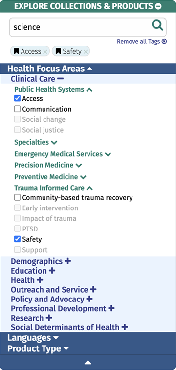
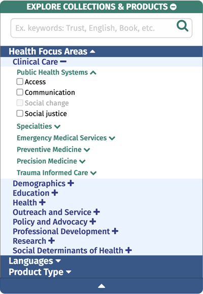
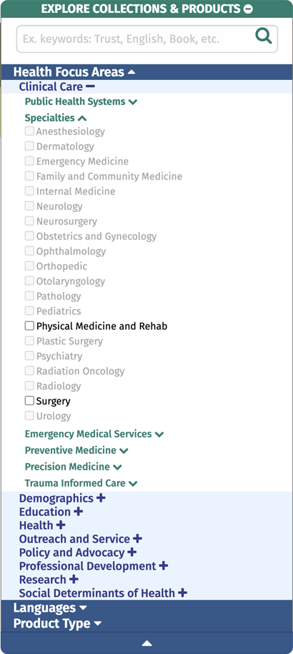
One of the more difficult parts of a project of this scale is taxonomy. How does one cover the width and depth of hundreds of health programs that cover basically everything. Beyond the usual metadata layer, we worked with MCW to find a three level hierarchical database that could cover everything and leave room for programs that haven't been created yet.
Design Strategy
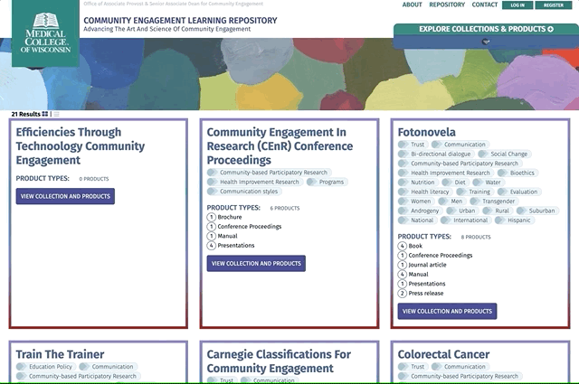
Once the data was agreed upon, we started our wireframing process to illustrate a search and discovery system that would help people know the width and depth of the data as they were interfacing with it. We created a wireframe for every screen a user might interface and used real data as much as possible. Creating wireframes with fake data or placement text misses an opportunity to keep the search and discovery system as human as possible.
We wireframed the account and project administration functions for a contributor, and found ways to make it as easy as possible to want to add content and be accurate about the data. The most important user in a shared knowledge database is the person who's posting that knowledge, and we wanted to make sure this worked for them.
For the search and discovery, we took great pains to avoid places where people could get lost or stuck. If there was a click that would return zero results, we needed to show the user before the clicked on it. If there was an opportunity to show the tip of an iceberg and give someone a chance to see into the future, the interface had to give them that chance. For the search / discovery panel, when a visitor first arrives to the site, we have the first level open as deep as it goes, allowing someone to see the depth, and be able to more quickly assess the taxonomy.
One of the examples of that was our three level hierarchical data taxonomy -- people needed to know the tags but we created rollovers to help people understand the hierarchy. They'd already seen the three levels in the open search and discovery panel above, now making the connection that the tag they see is part of that taxonomy helps them connect the results to their search.

One of the common outcomes of modern UX (user experience) design is simplicity over everything -- to remove choices to make the product less of a cognitive load. We find that removing choices leads to a less usable product for at least some people. To solve this, we create choices that have modality, multiple modes someone could be working within. Someone could be poking around to see what kind of data exists, or someone could be looking for that one program they know exists, or they could be a power user going deep into all the studies. Removing functionality removes modality, we want to increase it.
For CELR, or any Byte data project, a keen visitor will notice modality built into the site. Any feature that opens an advanced menu or allows for a zen mode, or shows and hides large amounts of functionality is that modality.
Build
Since we had already designed the data, extracting a data schema wasn't difficult, and we immediately created an administration area to make adding and editing data quick and easy. And since the wireframes covered the way it all worked, our programmers knew what they needed to build and were able to move rather quickly.
The trick for the programming team was to get the interface to respond quickly and give the visitor immediate feedback and the ability to look around corners. Creating the site as a single-page application helped make the feedback quick and easy. In the UX field, we consider the cost of a click, every time someone clicks on an application or website, there's a wait time that nobody wants to wait for. If we can build an application to respond within a performance budget of 1/2 second, and it's a useful change, we extend the time before a visitor will become frustrated. And if we show the visitor what would be a wasted click, we've avoided even that 1/2 second.
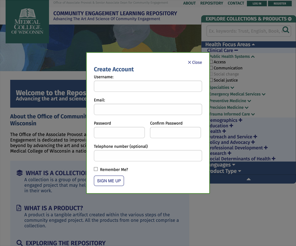
Most web applications will have an account system, the ability to log in and out. CELR is licensed with an open license, Creative Commons 4.0 non-commercial with attribution. We want people to use the data, to cite it, and to be able to expand on it. Having an account feature isn't the same as requiring an account feature, and allowing the visitor free reign as far as possible is how the internet was designed. We helped MCW find that line, and created an account system that allows people to sign up over the top so they wouldn't lose their place when signing in.