Work
filter your experience

The Power of Synthesis: Building a Cohesive Brand and Website for Rutland Free Library
Rutland Free Library (RFL) is a midsized, single-branch public library in central Vermont that serves as a vital community hub for literacy, culture, and lifelong learning. They came to us seeking an updated brand and website that better reflected their role as a welcoming, resourceful, and future-ready library.
Making Sense of a Messy Discovery
Discovery with RFL was intentionally collaborative—and a little messy. We worked closely with their team, gathering input from multiple staff members through worksheets and guided prompts. Each person shared their own view of the library’s audiences, priorities, and goals, resulting in overlapping terms, nuanced differences, and edge cases that all needed to be accounted for.
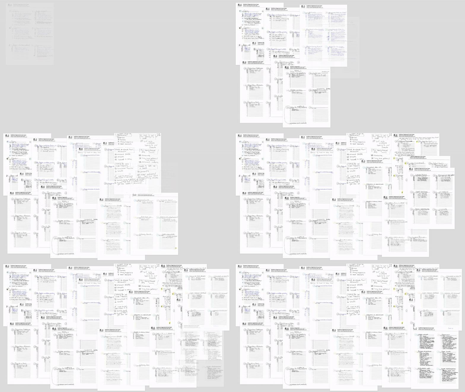
For example, what appeared as Retired, Retired Population, Retired Locals, Seniors, Grandparents across different responses was distilled into a single, inclusive audience segment: Retired / Seniors.
Our role was to act as the master synthesizer—organizing and normalizing all this raw input into a clear, actionable framework. We iterated with the RFL team until we had a cohesive set of audience segments and use cases that truly represented both the library’s core patrons and those on the margins.
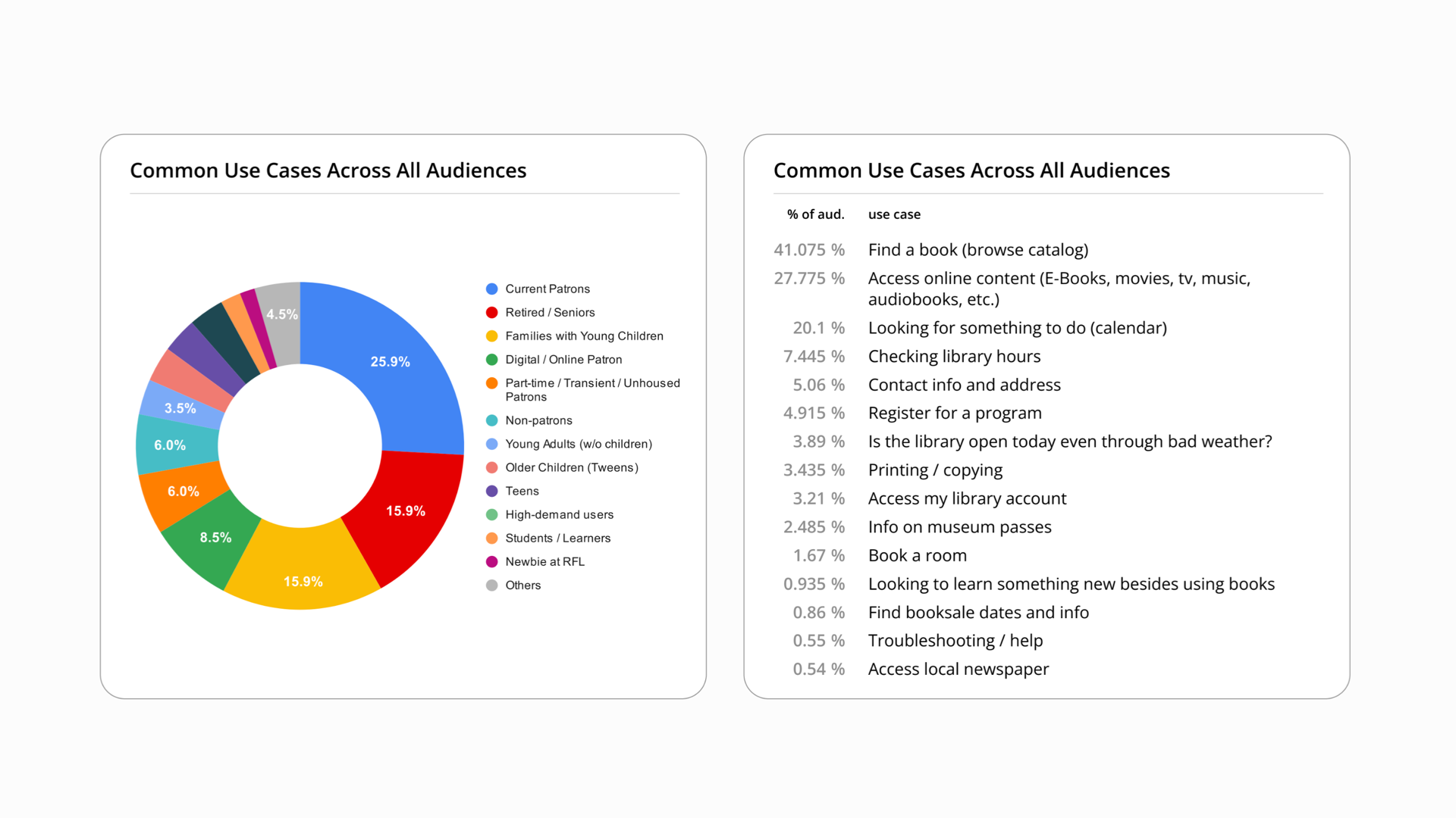
Patron Results
Our synthesis would be the foundation for the site's content strategy and information architecture.
Designing an Intuitive Yet Tangible Site Map
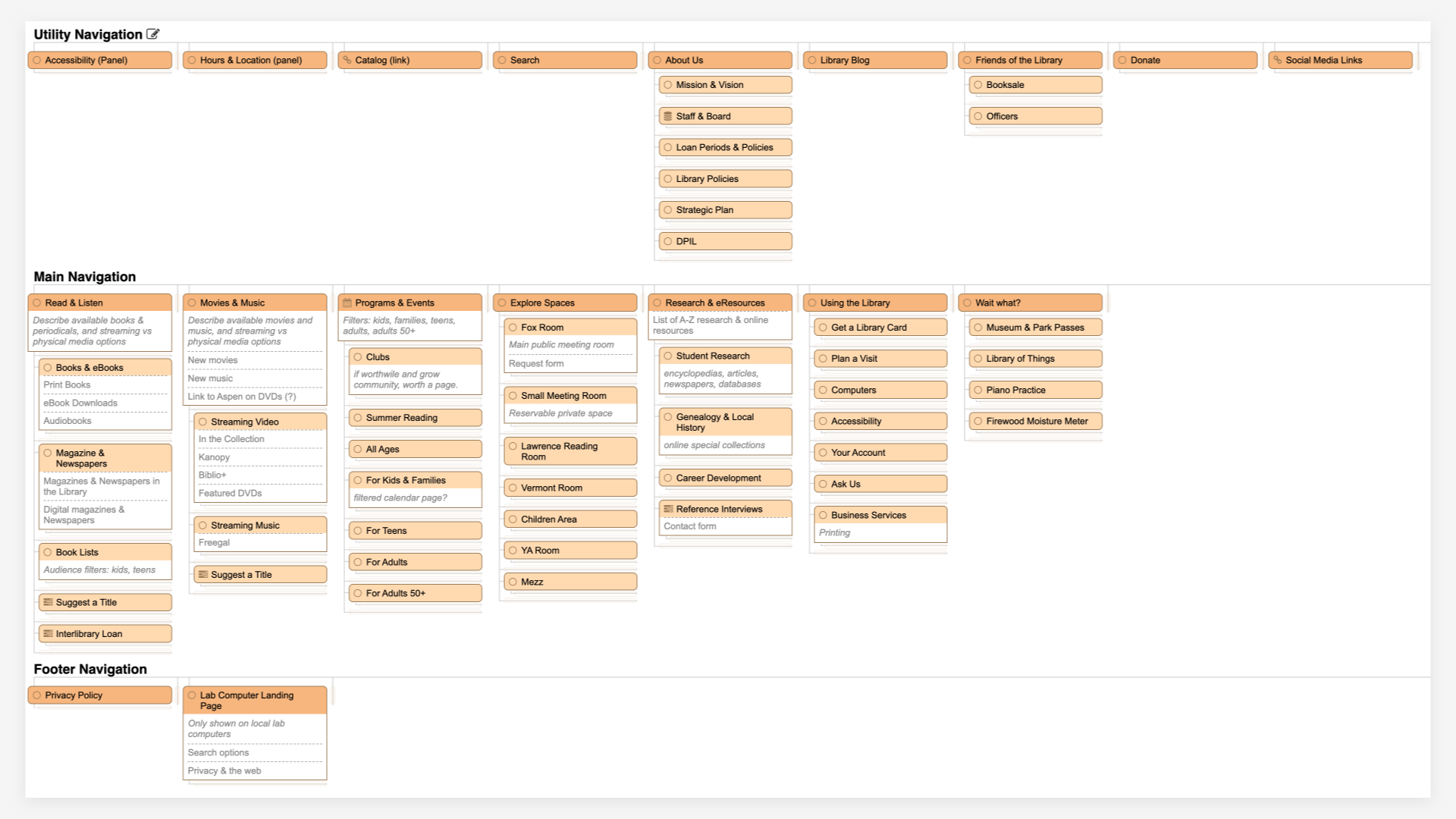
With a clear understanding of RFL’s current and prospective patron base, we moved into structuring the website. The goal was to create a site map that felt intuitive yet expansive, clearly communicating the full breadth of offerings available at the library—without overwhelming visitors.
We worked collaboratively with the RFL team to:
- Prioritize key user pathways based on the audience segments and use cases uncovered during discovery.
- Group and label content in plain, approachable language that resonates with how real patrons search for information.
- Ensure that both high-frequency needs (like checking accounts or finding upcoming events) and less obvious resources (like genealogy research or community services) were surfaced in a way that felt equally accessible.
This foundational structure set the stage for a website that’s welcoming, easy to navigate, and reflective of the library’s multifaceted role in the community.
Laying the Groundwork for the Brand
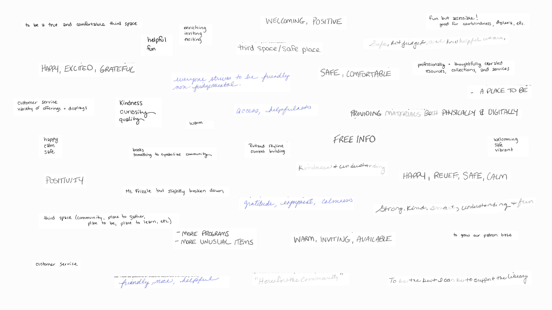
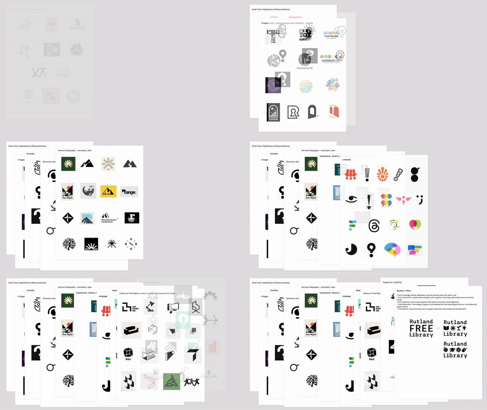
We also asked deeper questions—about who uses the library, what strengths and weaknesses exist, and how the community sees the library today versus how it aspires to be seen. This helped surface themes like welcoming, helpful, resourceful, and safe, giving us a meaningful foundation for the brand direction.
The Final Brand
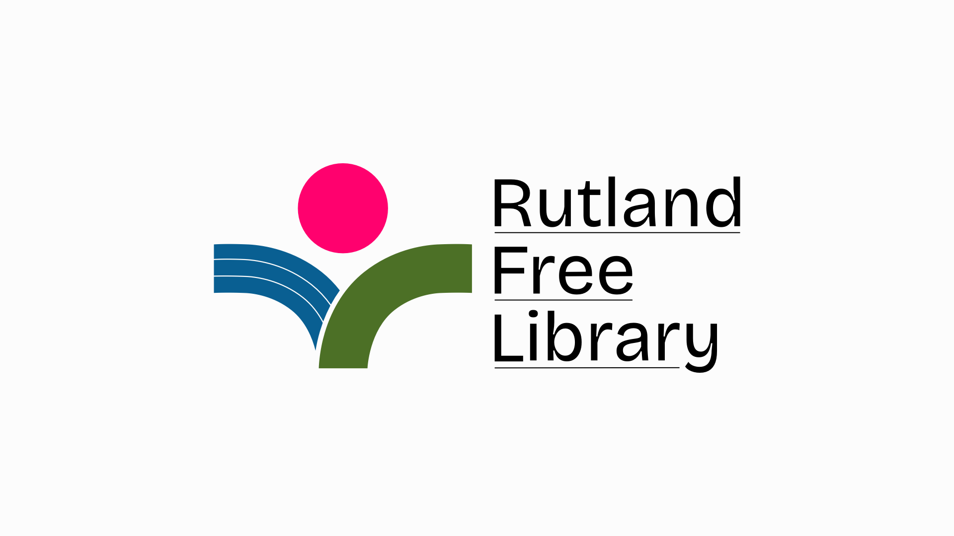
The final brand for Rutland Free Library strikes a balance between traditional familiarity and contemporary warmth—reflecting the library’s role as both a historic institution and a vibrant, evolving community space.
Color Palette: A cool, grounded palette with a subtle pop of pink brings an inviting energy. It feels rooted in Vermont’s natural landscape while adding a fresh, approachable twist.
Typography: Readable yet distinctive fonts add personality without sacrificing accessibility, infusing the brand with a sense of charm and warmth.
Logo: The logo mark pays homage to Rutland’s mountainous backdrop, with a glowing sun cresting over the horizon. Subtly woven into this landscape is a nuanced depiction of a patron reading—a quiet nod to the heart of the library. Hidden letter “R” forms reinforce a sense of place, while the stacked wordmark configuration gives it a versatile, timeless structure.
Together, these elements create a visual identity that feels resourceful, welcoming, and uniquely Rutland—a reflection of both the library’s physical setting and its role as a third space for the community.
Site Design & Brand Extension
Extending the Brand Online
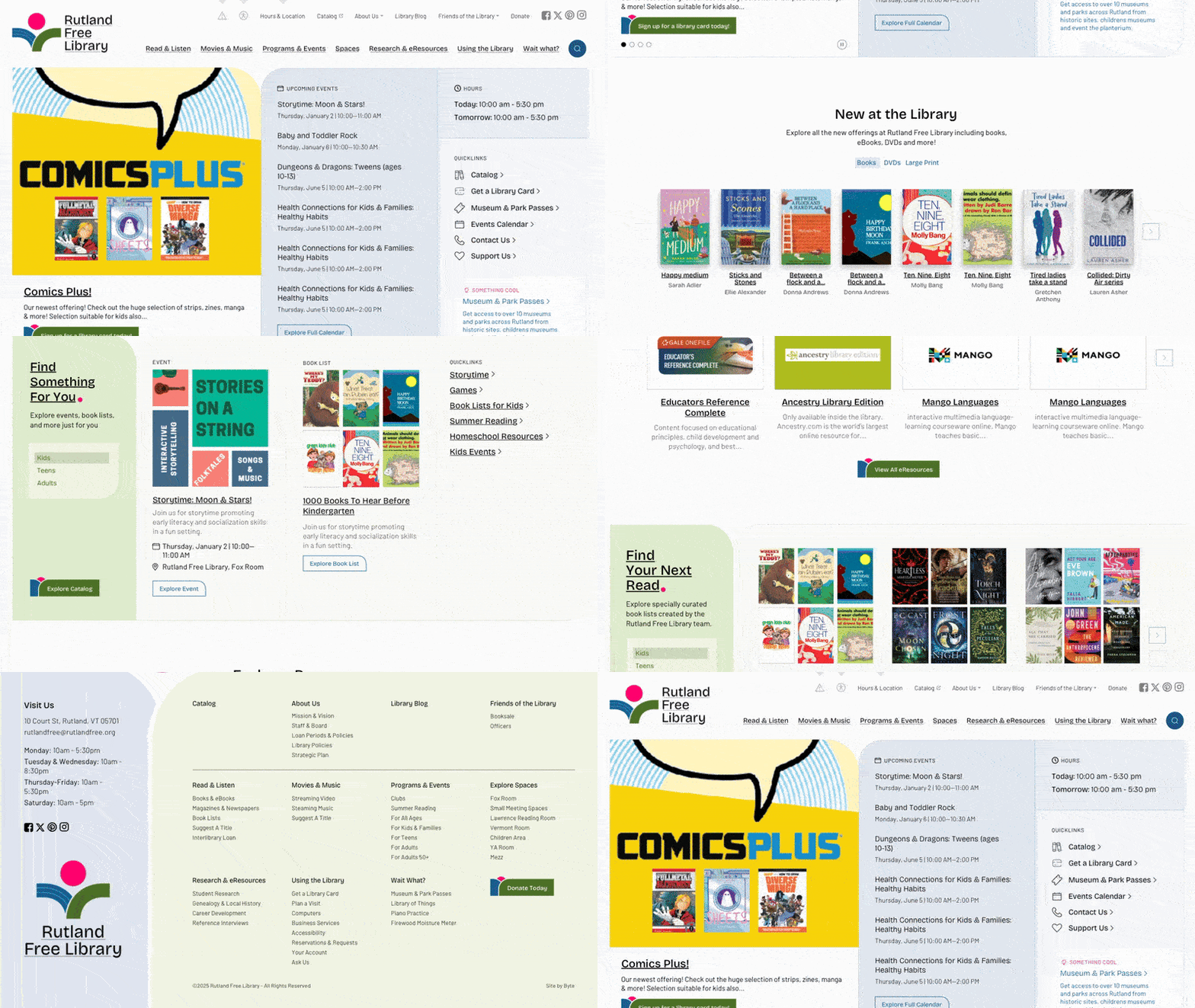
With the refreshed visual identity in place, we extended the brand into an interactive, digital experience. New design elements were explored and defined, ensuring the website felt like a natural extension of the RFL brand—approachable, clear, and full of small moments of charm.
Features That Empower the Library Team
Beyond the look and feel, the new site was built to support RFL’s staff and patrons alike with thoughtful new features:
- eResources Explorer: A streamlined way for patrons to discover the library’s digital offerings.
- Book Lists Explorer: Curated staff picks and reading lists surfaced in a more engaging way.
- Improved Calendar System: A clear, user-friendly way to browse events for all ages.
- Federated Search: A single search bar that pulls results from both the library catalog and the website, making it easier for patrons to find what they need in one step.
These features not only make it easier for RFL to disseminate relevant information but also give the team a more flexible toolkit to shape their editorial voice—allowing them to highlight programs, resources, and services in ways that better serve their community.
From Input to Impact
The Rutland Free Library project showcases the power of thoughtful synthesis—turning a wide range of staff input into a cohesive, community-centered brand and website. By listening deeply, organizing collaboratively, and designing intentionally, we helped RFL create a digital presence that reflects their identity and supports their evolving role in the community.
The result is a brand and website that feel unmistakably Rutland: resourceful, welcoming, and built to grow alongside the needs of their patrons.